Coca-Cola says good bye to its signature white wawe and welcomes a big red spot as the main feature in its new package.
The Red Disc, the signature element of the new “Taste the Feeling” global creative campaign launched in January, will now appear prominently on packaging, which is designed, says the company, to enable consumers to choose the Coca-Cola that best suits their taste, lifestyle and diet.
The new packaging will be available in stores in Mexico the first week of May. Similar versions of the Red Disc graphics will roll out into additional markets around the world throughout 2016 and into 2017.
The new packaging graphics were unveiled at an event this evening to celebrate the roll out of the “One Brand” approach in Mexico.
Another step to embrace the “One Brand” strategy
“Packaging is our most visible and valuable asset,” said Marcos de Quinto, Chief Marketing Officer, The Coca-Cola Company. “The Coca-Cola Red Disc has become a signature element of the brand, synonymous with great taste, uplift and refreshment. By applying it to our packaging in such a bold way, we are taking the next step towards full adoption of the “One Brand” strategy, uniting the Coca-Cola family under one visual identity and making it even easier for consumers to choose their Coca-Cola with or without calories, with or without caffeine.”
https://youtu.be/mwr0pHWr30Y
On thevideo.- “professor”. Any problem to watch the spot?, just click here
The Company recently announced the launch of the “One Brand” approach, which extends the global equity and iconic appeal of original Coca-Cola across the Trademark and is designed to enable consumers to choose whichever Coca-Cola suits their taste, lifestyle and diet. In support of the strategy, the Company unveiled “Taste the Feeling”, which is now live in 195 markets and includes 12 television commercials – three that debuted for the first time in Mexico: “Professor”, “Empty Bottles” and “Antarctic Summer” – in addition to more than 100 campaign images, a visual identity system and a music anthem and audio signature.
First unification of the Coca-Cola brands in 130 years
“The unification of the brands through design, marks the first time in our 130-year history that the iconic Coca-Cola visual identity has been shared across products in such a prominent way,” said James Sommerville, Vice President Global Design, The Coca-Cola Company.
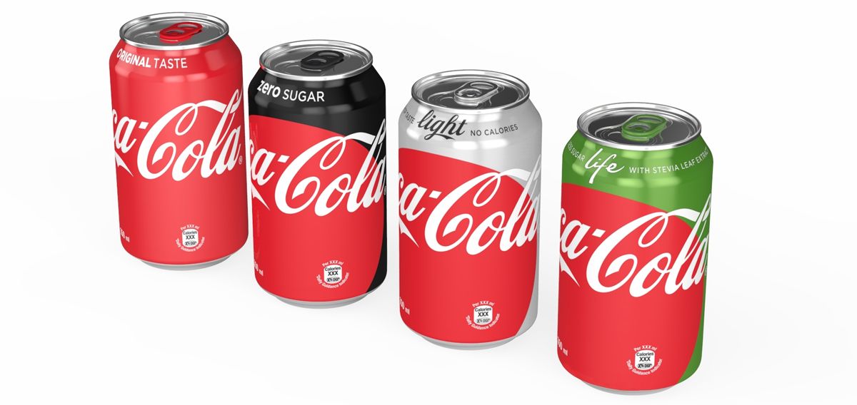
“When applied across packaging, retail, equipment and experiential, this new approach becomes a global design language that utilizes a historical brand icon to present the range of Coca-Cola products available today in a contemporary and simple way,” Sommerville added.
Signature color of each product to provide a clearer choice
To clearly identify each product, the signature color is featured throughout the packs – black for Zero, silver for Light/Diet and green for Life. The new graphics will also include the unique product name and benefits on front of pack to help consumers make an informed choice: Coca-Cola Original Taste (or Classic in select markets); Coca-Cola Light/Diet (crisp taste, no calories); Coca-Cola Zero (zero sugar) and Coca-Cola Life (less Sugar, with stevia leaf extract
Image over the headline.- Coca-Cola “One Brand” Packaging – 8oz glass bottle line up (Photo: Business Wire)
Related external links:
Related Eastwindlinks: