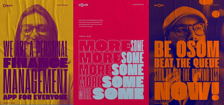
The Russian agency Voskhod has created a corporate identity as ever changing and varied as OSOM services are, with no common colors, fonts or sizes.
Digital service OSOM finance offers a revolutionary approach to finance management. It’s the world’s first application for private users that allows managing traditional and digital assets through one account.

The app currently allows converting euros to crypto currency, managing bitcoin and ethereum wallets. All operations are legal, swift and economically effective. The app is being developed to offer new functions and investment tools.
Voskhod also is responsible for the design of OSOM finance’s app.

Such dynamic service deserved in the agency’s view the most dynamic ever changing corporate identity ever designed.
The idea of constant ongoing transformation lies at the core of the brand style, symbolizing ease of finance management and currency.
¿How could it be provided an infinite number of varied solutions fitting into a single graphic identity system?.

Voskhod has brought to tygraphy the technique of morphing which is common for computer animation. This technique allows to smoothly transform font variations and its color pallet as well.

The result, an ever changing corporate identity and brand as flexible as the company it identifies.
Braking the rules, also any branding rules, the Russian revolution is here!
Image over the headline.- The ever changing OSOM corporate identity and brand. © Voskhod.